Processing a 10-year backlog of images for the USDA
I led design for an image uploader that would help PLANTS site admins support the research efforts of over 1 million yearly visitors.
The challenge
Our three stakeholders maintained the PLANTS website and faced a 10-year backlog containing 20,000 images that they had to upload, tag, and organize.
As a CX team, we saw four challenges from the start:
- The admins wanted bulk image upload capability but had captured less than four sentences of requirements in JIRA.
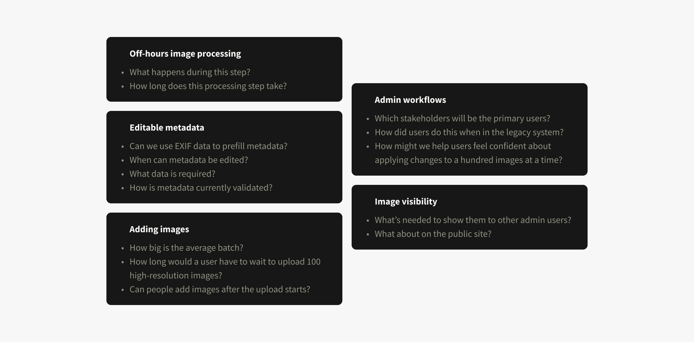
- Without a UX researcher, Bridget—my content strategy partner—and I would have to uncover requirements.
- The PLANTS team's experience working with designers was limited to a visuals-only website update.
- Rob—our lead engineer—thought the uploader needed an unconventional off-hours step but wouldn't have time to research this for two sprints.
Our approach
Jumping into designs isn't ideal but in our situation it was important to get a head start while we had lead time on engineering. I knew from experience that backend decisions made without design input are often hard to change and force awkward designs.
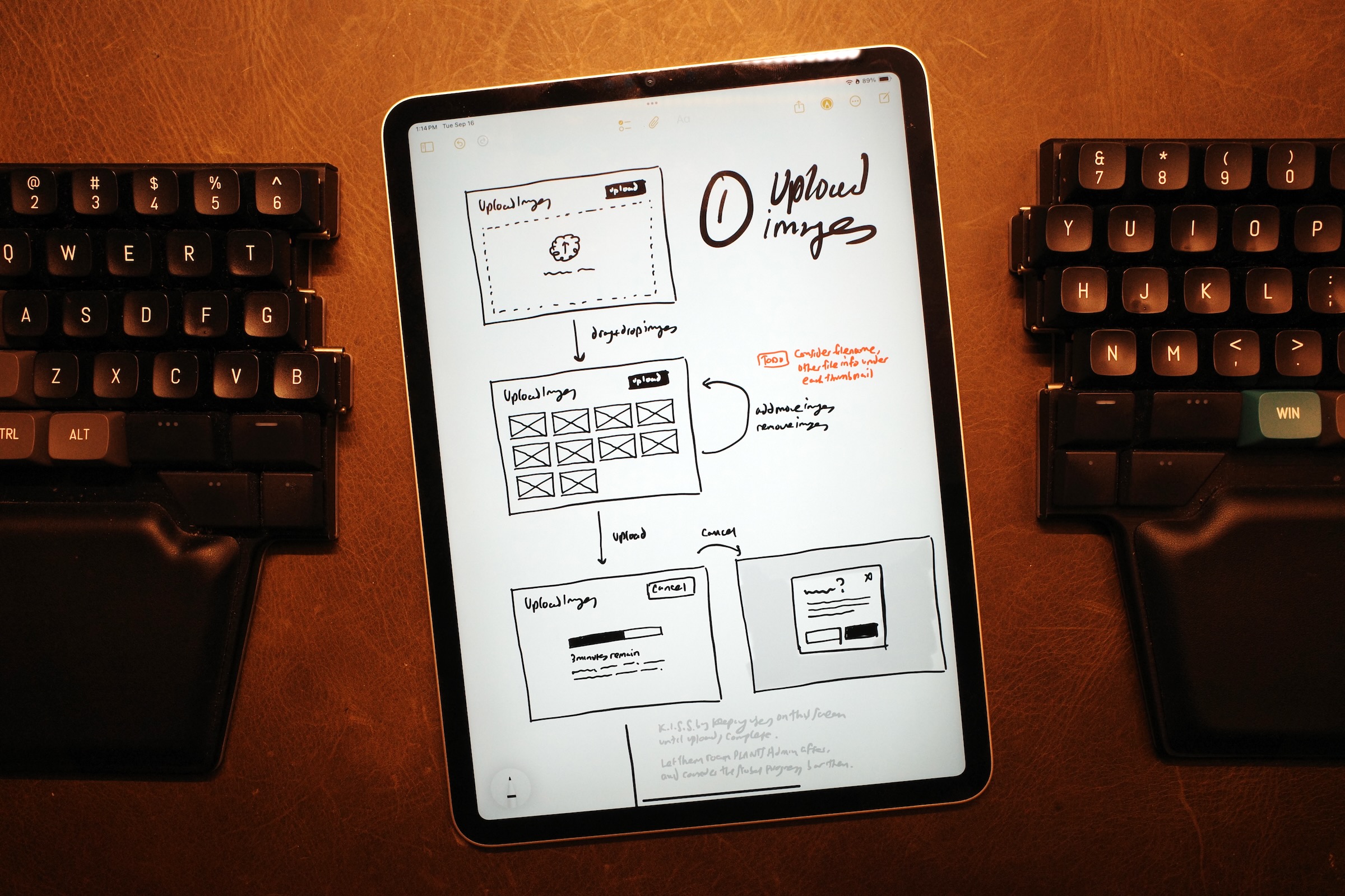
I started by brainstorming system elements that a bulk image uploader might have, after early conversations with teammates and analyzing similar flows in Shopify and Payload.
I used those elements to inform rapid sketches and wireframes, designing in the open to aid our discovery conversations. This led to three design directions that helped...
- show how reordering key steps impact usability and engineering lift
- give stakeholders clear artifacts to reference and discuss
- gather feedback from Rob and Bridget while they were busy with other work
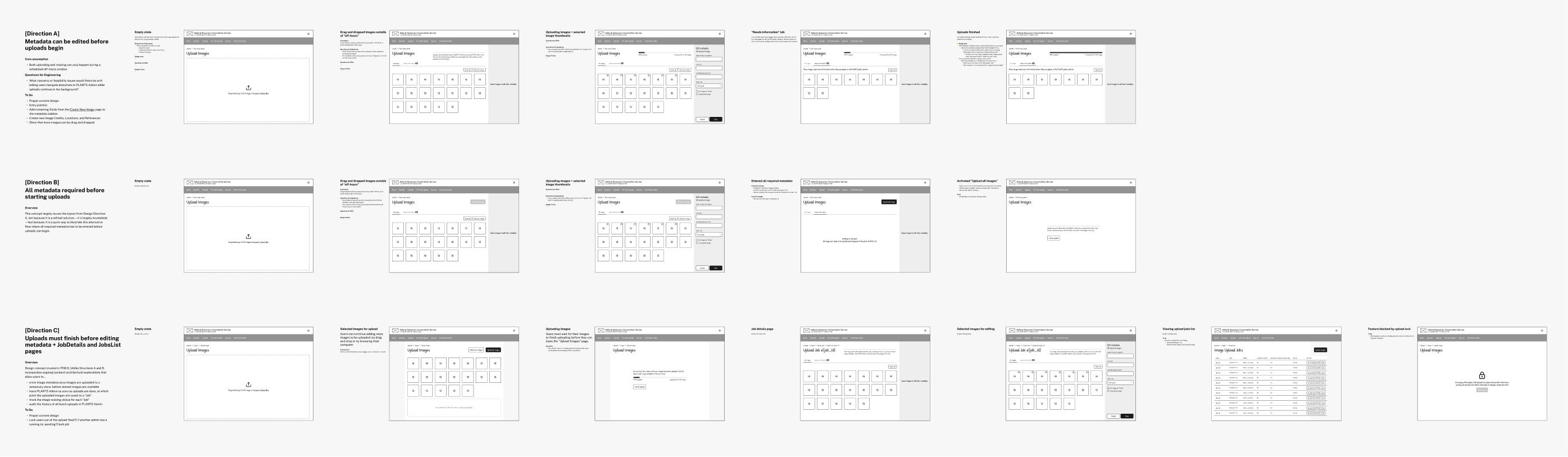
Converging on a design direction
Once Rob outlined a more concrete backend architecture we could iterate on the designs with Bridget to incorporate technical constraints.
We dropped Direction A because images had to be uploaded to a server before users could edit the metadata. We also dropped Direction B since asking users to enter metadata for 100+ images in order to start the upload created a risk for data loss.
Stakeholders were excited about Direction C but I felt something was off and had trouble figuring out why. With more conversations and reflection I realized that I'd designed one page to do too much—handling both status updates and metadata editing created would create edge cases if admins deleted images or recategorized them after their initial upload.
That insight led to a fourth design direction that framed the Job Details page as a historical record. Limiting its scope to showing upload status simplified the flow and eliminated the edge cases.
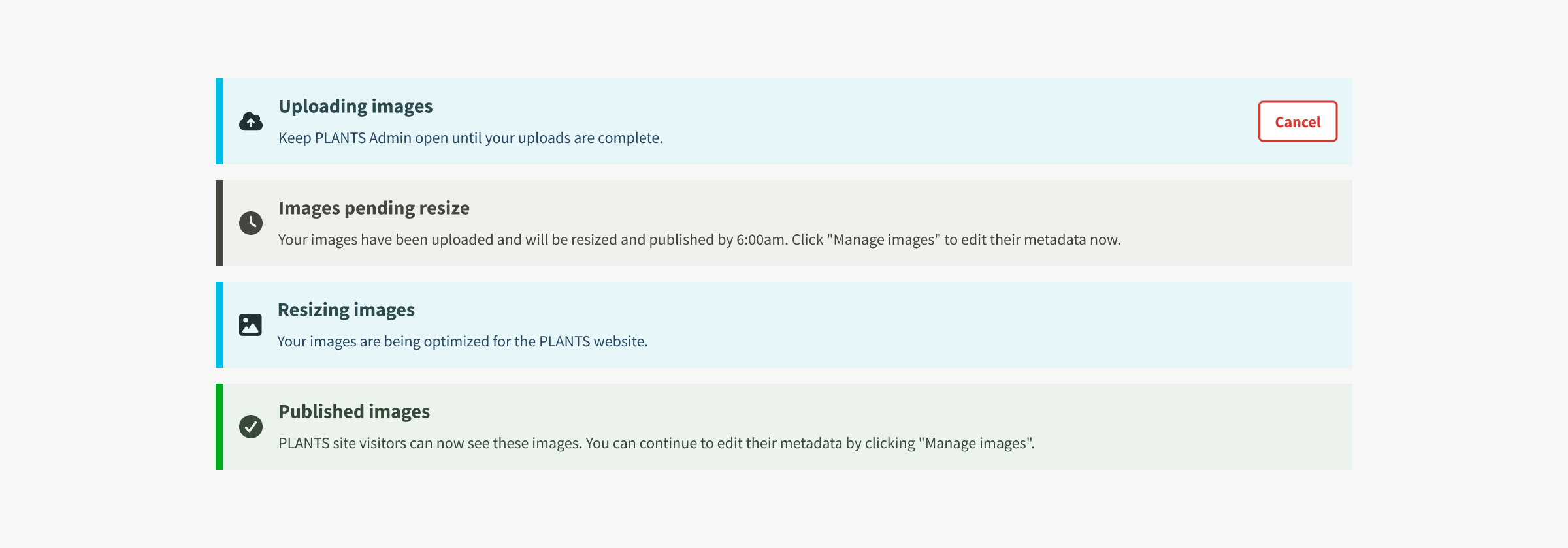
Communicating status changes
Engineers first suggested a globally-visible progress bar to communicate status, but I convinced them to keep status messages on a single page. It wouldn't have been useful for Admins to see a "pending" status for most of their work day.
Disclaimer: We were furloughed from this project due to budget cuts across the US government. I made the following designs after our dismissal.
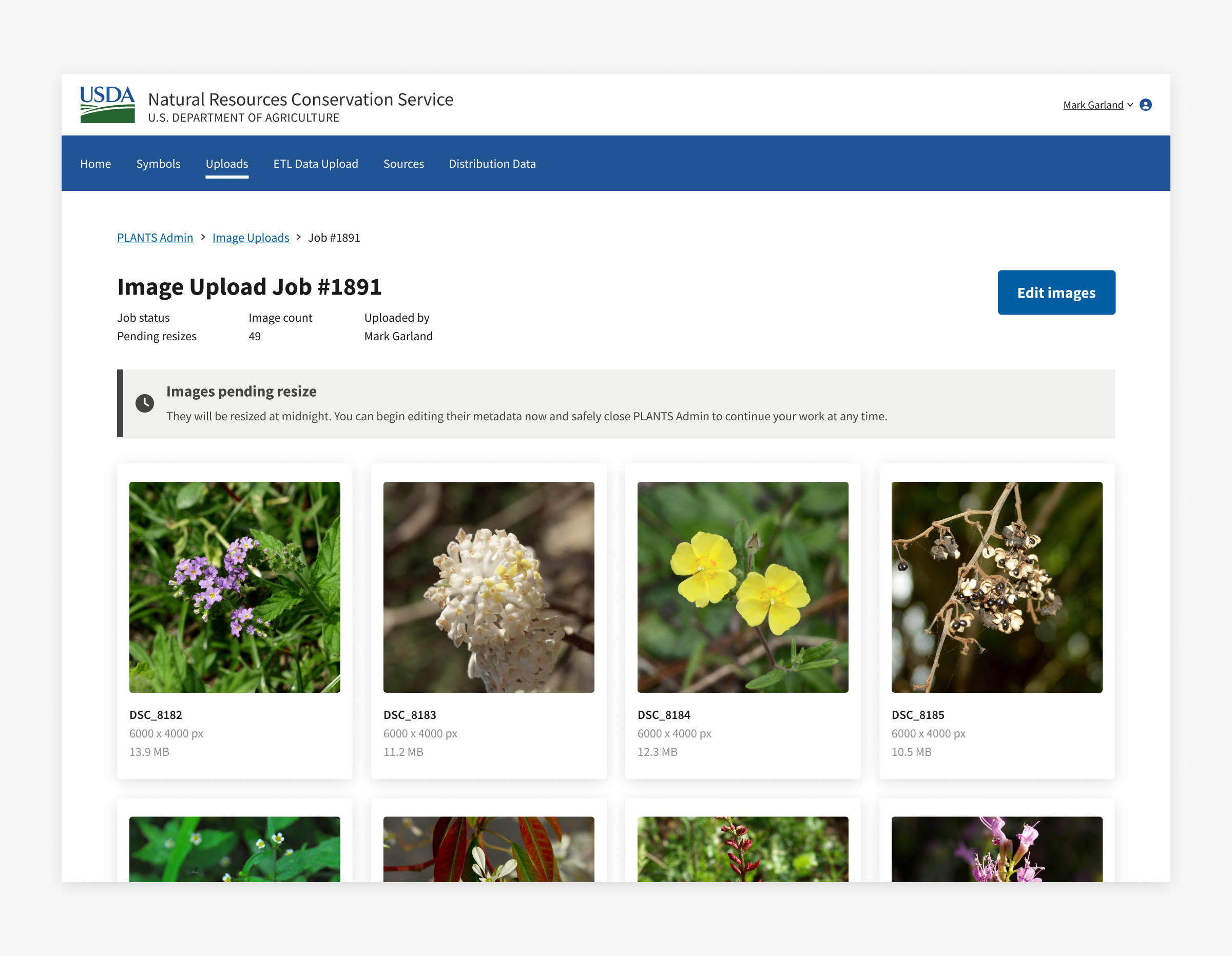
The messages for each step use plain language so users can quickly understand what they can do and if it’s safe to close the app without losing their work.
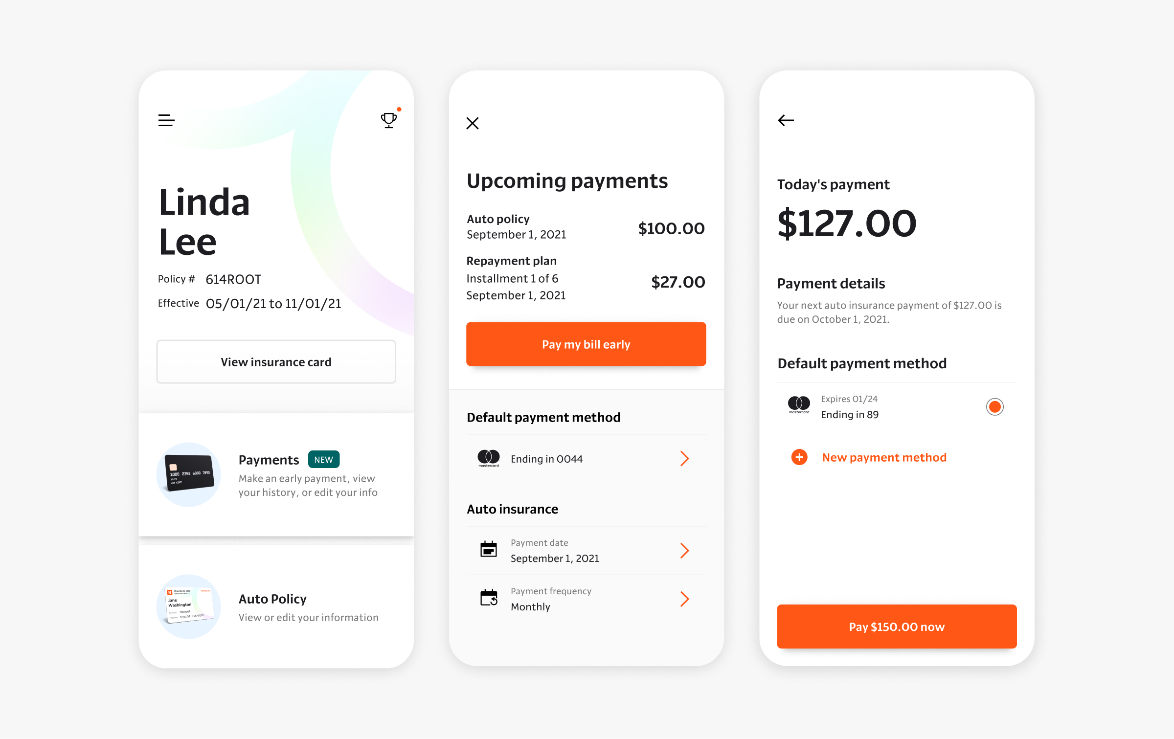
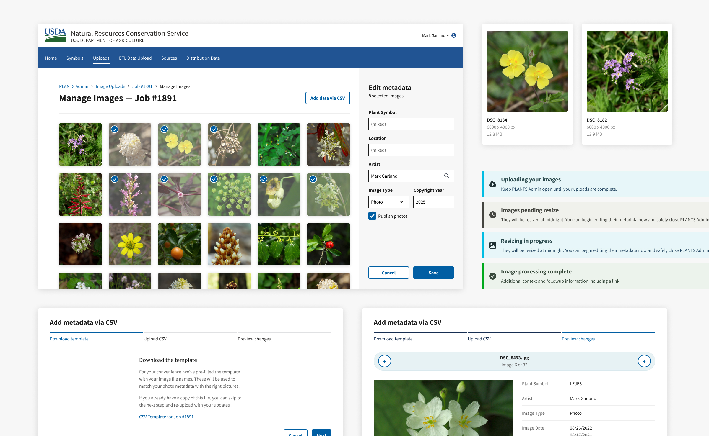
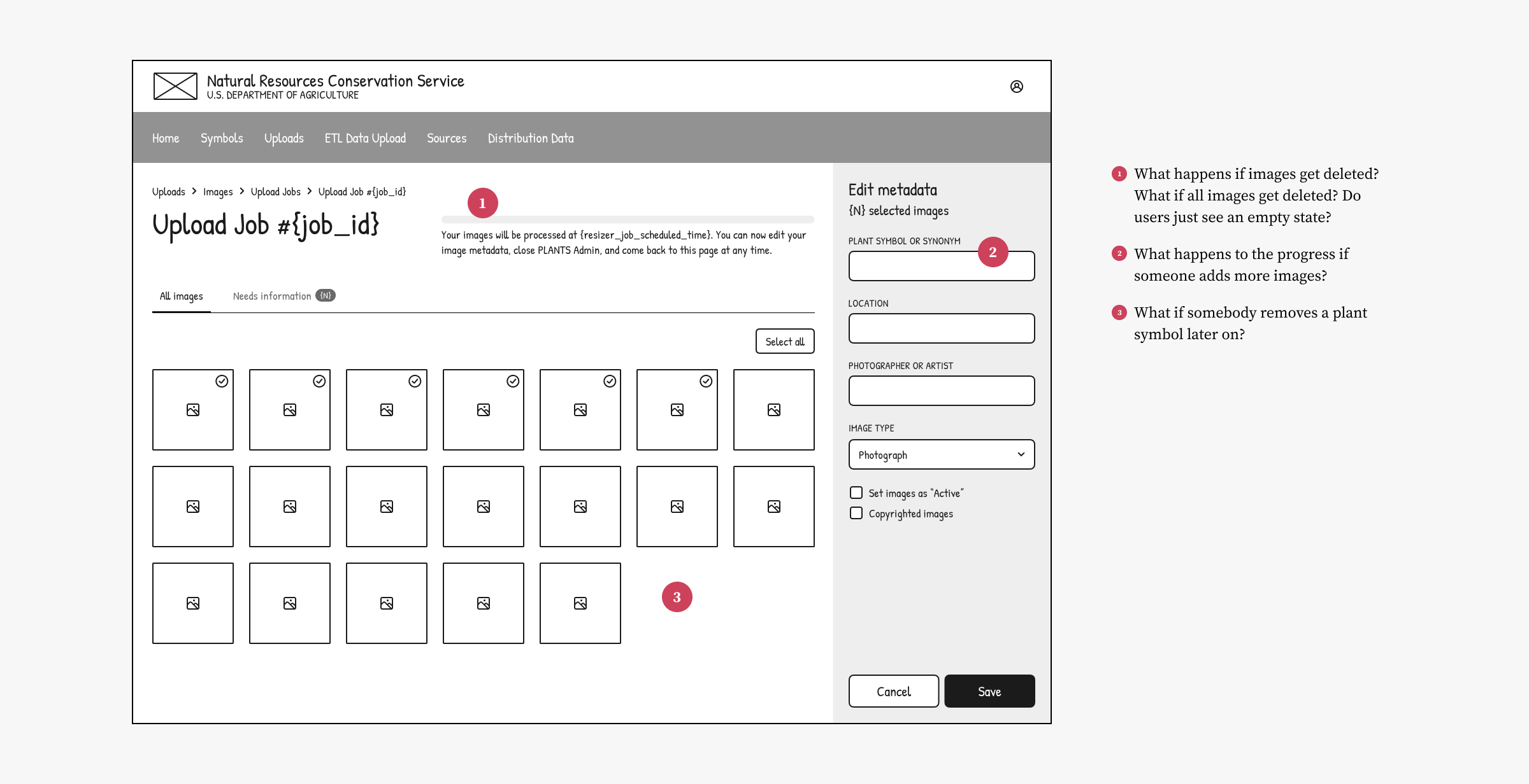
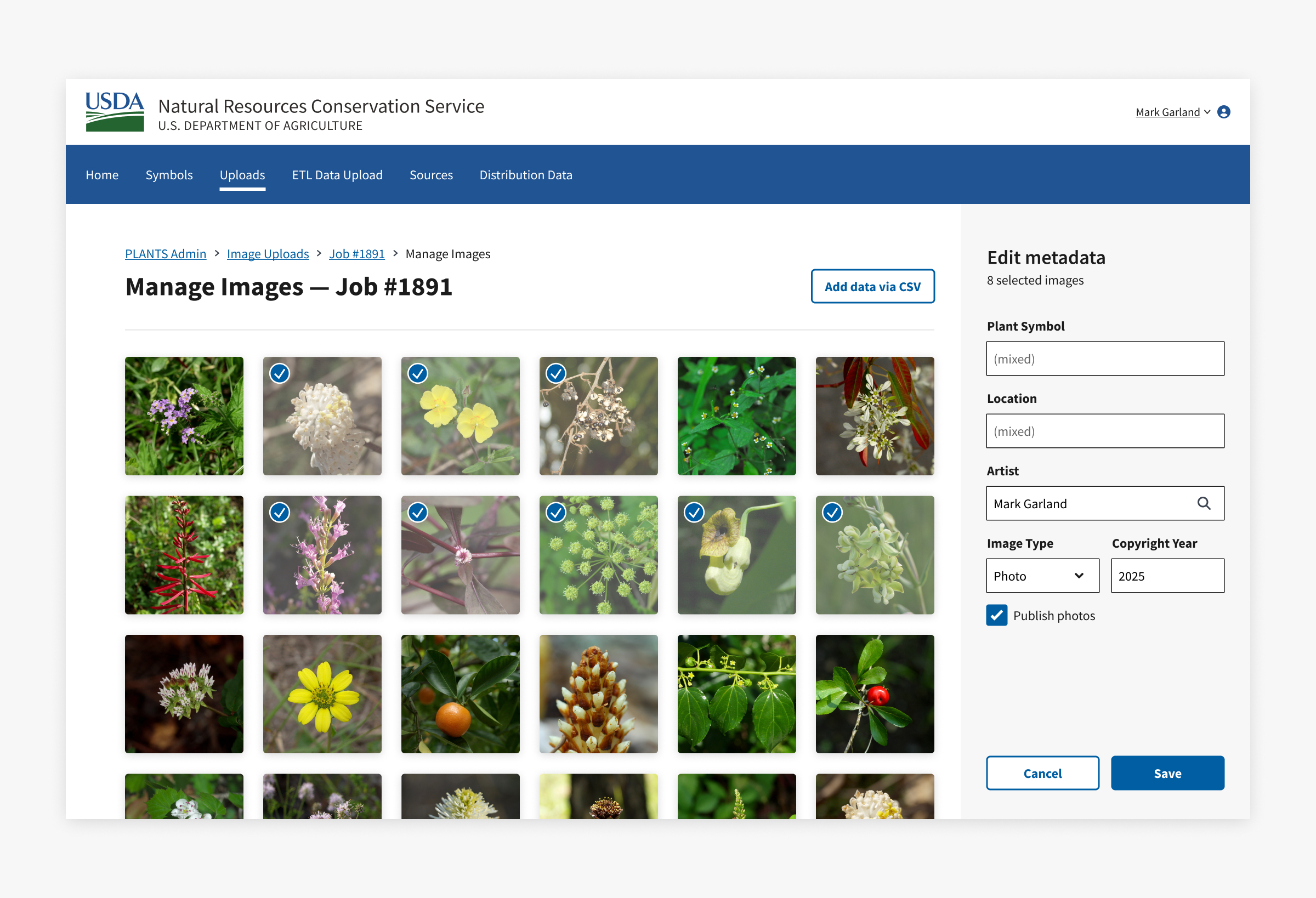
Editing image metadata
Users can manage image metadata on a separate page. The layout leans on the familiarity of photo editing apps that let users select their images on the left and edit their info on the right.
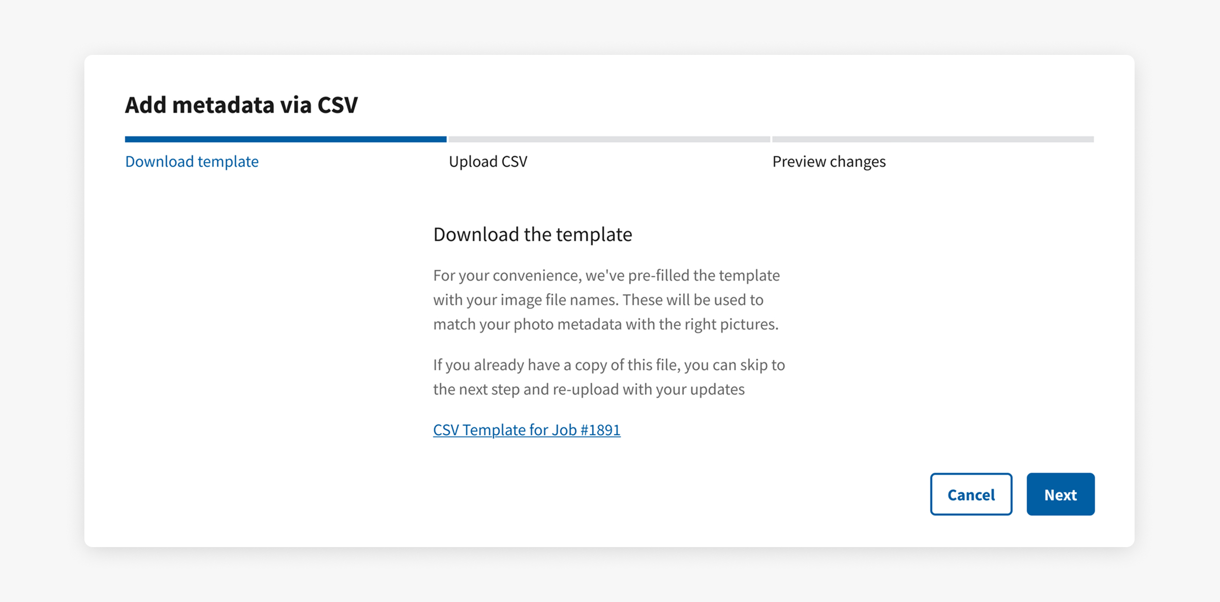
Guiding users through the CSV flow
While most CSV import flows downplay the ability to download a template, I dedicated the first step in a guided modal for this because...
- our app depends on filenames to match images with their metadata.
- prefilling file names prevents the mistakes that users could make when typing them manually.
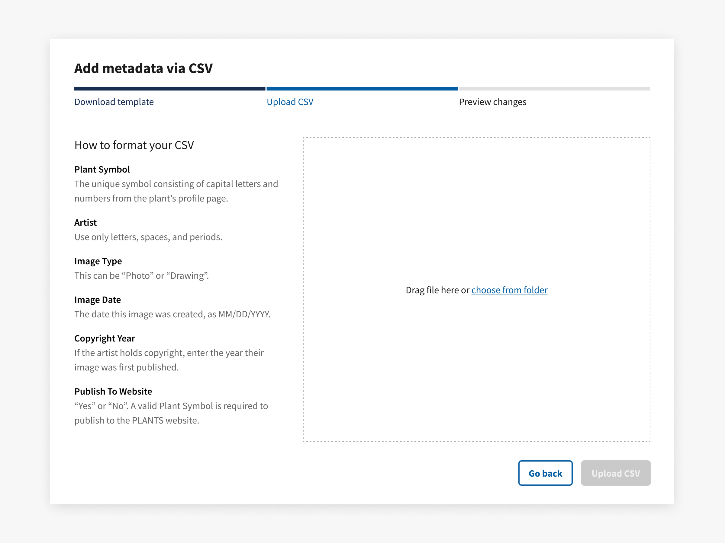
The second step tells users how to format their CSV. Showing them that a "Preview changes" remains lets them know that uploading their CSV won't immediately apply their changes.
The third step lets users spot-check their images and feel confident that their data will be applied correctly.
Fields that will be overwritten show the new value by the crossed-out old value. Showing the the filename and row number helps users track down any changes they need to make in the CSV.
Managing uncertainty by classifying risk
It was a challenge to move design forward when starting with nearly zero requirements and a backend that was going to be planned in parallel.
What went well was ranking design decisions as high, low, or no stakes and using that to inform when and how much time we spent on each.
Things like scope definition, workflow sequencing, and information architecture are high stakes decisions, so we gave ourselves more time in the beginning to explore divergent directions. On the other hand, we deferred decisions about microcopy and component choices since we could could change those much later without seriously impacting the bigger picture.
The result was that we bought ourselves enough time to have conversations with stakeholders without getting bogged down in decisions that were too early to make.